Monday, August 4, 2008

Star Plots

- Star plots allow you to compare multiple variables for each observation.

- This star plot was used to represent the differences in automobiles in 1979. I thought this was kinda of cool to see how different individuals came up with the different ways to star plot a vehicle.

- http://www.itl.nist.gov/div898/handbook/eda/section3/gif/starplot.gif

Similarity Matrix


- A similarity matrix is a matrix of scores which express the similarity between two data points.

-This display shows correlations/co-occurrences between two groups of objects, or between objects belonging to the same group. One group of objects is presented as the rows of the similarity matrix and the other as the columns. The matrix cells are color-coded based on the similarity values. Blue indicates positive values and red negative ones. The scale of the colors is -1..1 by default, but if the similarity values exceed this region, the thresholds are scaled such that full blue and red colors represent the 90% percentile of the value range.

Stem and Leaf Plot


- A stem and leaf plot is a device for presenting quantitative data in a graphical format, similar to a histogram, to assist in visualizing the shape of a distribution.

-Study the data for Infant Mortality Rates, the number of infant deaths per 1,000 live births, of countries in Western Africa. Use the World Population Data Sheet in your Reference Section. You will notice that most of these values are in the interval 100 to 175. A stem-and-leaf plot for this data is shown below.

Box Plot

- A boxplot, or box and whisker diagram, provides a simple graphical summary of a set of data.
- The lines on the box plot image above represent the locations of the lowest number, first quartile, second quartile, third quartile and highest number, in relationship to a scale, running from 0 - 140.

Histogram

- A histogram displays tabulated frequency.

- Histogram of column. This chart displays a bar chart of the relative frequencies of different value ranges. It's useful for getting a quick look at the distribution of values of the selected metric column. The more values fall in a range, the higher the bar. In the above chart you can see that a typical procedures name consists of 7-16 characters. Shorter and longer names are fewer. There are no names with just 1 or 2 characters.

- http://www.aivosto.com/project/help/pm-histogram.gif

Parallel Coordinate Graph


- In the parallel coordinate plot, each variable is graphed on a vertical axis. A data
element is plotted as a connected set of points, one on each axis.

- This parallel coordinate (PC) graph (4) serves as the control panel for selecting attributes to be explored and provide easier identification of multivariate relationships across spatial domains in the choropleth maps and the scatter plot.

Triangular Plot


- A triangular plot usually uses three variables which sum to a constant. It graphically depicts the ratios of the three variables as positions in an equilateral triangle.

- The axes of the figure show the estimated fraction of the population intending to vote for each of the major parties; the white circle shows the current estimate from opinion polls. The coloured asses show the regions of the plot in which -- under the assumption of uniform national swing -- each of the corresponding major parties would win a majority in Parliament.

Windrose

- A wind rose is a graphic tool used by meteorologists to give a succinct view of how wind speed and direction are typically distributed at a particular location. Presented in a circular format, the wind rose shows the frequency of winds blowing from particular directions.

- The following is a wind rose used to reflect 5 Washington locations: Olympia, Quillayute, Seattle, Spokane, Yakima.

- www.climate.washington.edu/climate.html

Climograph

- A climographs is a graphic representation of the relation between temperature and
precipitation as plotted at monthly intervals throughout the year.

- This Climograph is of the Boreal Region, and this is evident with the amount of precipitation in combination with the high temperatures. The precipitation is higher then other regions in Quebec due to the high temperatures allowing for the clouds to rise cool and condense.

Population Profile

- Population pyramids display age and sex distributions for a given region.

- This population profile is just an example of how a census would be reflected. On census day, the population of Coventry was recorded to be 300,848 people. The population pyramid details the age and gender profile in Coventry in comparison to the national picture.

-http://www.coventry.gov.uk/ccm/navigation/community-and-living/coventry-statistics/2001-census-statistics/

Index Value Plot

- In this plot an index value is plotted instead of an absolute number.

- The following graph provides a comparison of the cumulative total stockholder return on our common stock against the Nasdaq U.S. Stock Market Index and the average of a peer group index comprised of five publicly traded consumer electronic and/or appliance retailers (1) since our initial public offering on November 24, 2003.

Lorenz Curve

- How a Lorenz curve works: The dashed line shows how the data would be graphed if income were equally distributed. The solid dark line (the Lorenz curve) represents the actual distribution.

- This Lorenz curve follows the diagonal 'line of income equality', where 50 per cent of the population receives 50 per cent of the income, 60 per cent of the population receives 60 per cent of the income, and so on. Chart A1.2 shows that the poorer 50 per cent of the Scottish population in 2005/06 received only 28 per cent of the total income, with the richer 50 per cent receiving 72 per cent of total income.

Bilateral Graph


- This type of graph usually has two related variables that have overlapped area. The overlapped area shows where the two variables meet.

- This map shows the deposits of the money sector. The two variables are the long term deposits versus demand deposits that will be withdrawn in a shorter period of time.

- http://images.google.com/imgres?imgurl=http://www.resbank.co.za/Economics/year96/graph/graph28.jpg&imgrefurl=http://www.resbank.co.za/Economics/year96/yearrep.html&h=256&w=261&sz=48&hl=en&start=195&tbnid=dNoJubJ4kJJeiM:&tbnh=110&tbnw=112&prev=/images%3Fq%3DBilateral%2Bgraph%26start%3D180%26gbv%3D2%26ndsp%3D18%26hl%3Den%26sa%3DN

Thursday, July 31, 2008

Nominal Area Choropleth Map

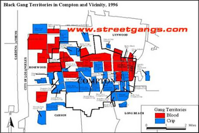
- Nominal Choropleth maps portray areal data that area broken down by a group or category.

- This map is being used to represent the location and size of two gangs in Compton California.

- www.streetgangs.com

Standardized Choropleth Map


- Standardized choropleth maps show areas are shaded or patterned in proportion to the measurement of the statistical variable being displayed on the map.

- This map shows the percentage of Canadians taken by the Census that were under the age of fourteen.

Univariate Choropleth Map


- Univariate choropleth maps, although they are sometimes extremely difficult displays only the distribution of a single variable.

- This map is a dispaly of the poverty levels in the United States.

Bivariate Choropleth Map

- A bivariate map displays two variables on a single map by combining two different sets of graphic symbols or colors. It is a variation of simple choropleth map that portrays two separate phenomena simultaneously.

- This map uses cartographic animation, so the map shows the rates between the rate in the individual states to a map that also shows the divorce rate by individual counties within each state.

- http://www.pop.psu.edu/images/gia/maps/changeanim.gif

Scatterplot


-A scatter graph or scatter plot is a type of display using Cartesian coordinates to display values for two variables for a set of data. The data is displayed as a collection of points, each having the value of one variable determining the position on the horizontal axis and the value of the other variable determining the position on the vertical axis.

- The screen shot below shows the scatter plot for Birth rate and Population growth rate and associated cross classification map. You can see that the items selected by mouse dragging (shown in the pink box) are highlighted with black boundary lines on the map of Europe.

Unclassed Choropleth Maps


- In an unclassified choropleth map the numeric attribute values are converted directly into proportional degrees of darkness, i.e. the higher the object's attribute value, the darker the shade representing it.

- The map shows the fertility rate attribute values for countries in Europe. The maximum fertility rate is 2.27 children born per woman in Albania and is represented by the darkest shade of orange and the minimum fertility rate is 1.13 children born per woman in Bulgaria represented by the lightest shade of orange.

Classed Choropleth Maps


- Classed choropleth maps are just a variation of a choropleth map, which are a type of theamatic map. In this type of map colors and shades reflect the value of the desired area.

- In this classified choropleth map the value range of a numeric attribute is divided into differently coloured intervals. For example in the screen shot above showing Fertility rate figures for Europe, those countries which fall into the lowest fertility band are shown in dark blue and those with the highest rate are shown in dark red.

Continuously Variable Proportional Circle Map

- A proportional circle map shows the relative sizes of objects or events. The larger the circle on the map, the greater the magnitude of the measured object by the scale.
-The map of Canada found at the Canada National Statistical Agency shows a continuous variable proportional circle map. There are two types of proportional circle maps. The best way to tell this one apart from the other one is from the legend. The circles come in all sizes representing the distribution of the variable.

Tuesday, July 29, 2008

DOQQ


- A Digital Orthophoto Quadrangle (DOQ) is a computer-generated image of an aerial photograph in which the image displacement caused by terrain relief and camera tilt has been removed. The DOQ combines the image characteristics of the original photograph with the georeferenced qualities of a map.

- The map above is a DOQQ of the Washington DC area. These types of maps seem very easy to see details.

- http://seamless.usgs.gov/website/seamless/products/1doqq.asp

DEM


- Digital Elevation Models (DEMs) consist of a raster grid of regularly spaced elevation values that have been primarily derived from the USGS topographic map series. DEMs are derived from hypsographic data (contour lines) and/or photogrammetric methods using USGS 7.5-minute, 15-minute, 2-arc-second (30- by 60-minute), and 1-degree (1:250,000-scale) topographic quadrangle maps


- The following files are a complete DEM for the Lake Tahoe Basin, created from the 18 7.5-minute quadrangles of 10-m DEMs and the bathymetric elevation model.The 18 DEM quadrangles that cover the Lake Tahoe Basin have been mosaicked together. The mosaicked files are more convenient for looking at areas throughout the basin or areas on the edge of two quadrangles.


- tahoe.usgs.gov/DEM.html

DLG

- A Digital Line Graph (DLG) is digital vector data representing cartographic information. DLGs contain a wide variety of information depicting geographic features.

- This map is of Crater Lake National Park covers twelve 7.5-minute quadrangle maps. These 12 DLG quads have been mosaicked together. The mosaicked files are more convenient for looking at areas throughout the basin or areas on the edge of two quadrangles.

- oregonexplorer.info/craterlake/dlg.html

Friday, July 25, 2008

DRG

- A DRG map is the original hard copy only, but now available in digital format as a DRG (digital raster graphic), a scanned and georectified image of the paper version).

- This map is of Denver, Ogden in 1899. This type of map is more of the DRG type of maps I have seen, because to archive only paper, could cause age problems with the paper. To ensure a good archive going digital was the best option.

- ghostdepot.com/rg/maps/index%20map%20other.htm

Isoline

- Isoline maps are used extensively in meteorology. They normally tell geopotential differences between areas.
- This map was showing the differences between the 6 h forecasts were analysed individually during the first days. On the first day of assimilation, the differences were located mainly over the extra-tropics for temperature, and over Land and near the coast for specific humidity, but these differences were spread (as expected) over the whole globe on the second day.

Isopach


- Isopach maps usually deal with rock or sediment thickness.
- This map shows the irregular contours in NW Johnson County due to karsting. The purpose of this map was to show how the effects of drilling to close will effect land stability.

Thursday, July 24, 2008

Isohyets

- Isohyets maps show predicted rainfall in various measurements.

- This particular map is showing the annual rainfall for a part of Asia. The measurements used in this map is millimeters.

- gb.weather.gov.hk/informtc/aere/rf.htm

Isotachs

- Isotach maps are used to calculate wind speeds. Lines that encompass areas, are of equal wind speed.

- This map shows Upper Level Dynamics and Mesolow Development – The Foothills mesolow also developed in an area favorable for enhanced lift, coincident with the left exit region of the 300 mb polar jet (300 mb winds, heights, and isotachs (colored) shown at 1200 UTC.

Isobar


- Isobar maps are to measure air pressure in certain areas. The way they work is, where isolines are close together, winds are the strongest.
- In this map we are just shown the wind pressure around the east coast. As you can see the lines are not very close together, which would indicate not much wind speed.

Tuesday, July 22, 2008

LIDAR

- LIDAR (Light Detection Ranging) optical remote sensing technology that measures properties of scattered light to find range and/or other information of a distant target. The prevalent method to determine distance to an object or surface is to use laser pulses.

- The following is a picture taken at ground zero in NYC September 27, 2001. This image is especially amazing, because it is gives a good visual of the amount of damage done to the area.

- http://imaging.geocomm.com/gallery/

Doppler Radar

- Doppler Radar is composed of two components, reflectivity and rotational velocity. When the two of them come together, they can help see hurricanes, tornadoes, and storm patterns.

- The picture above is of a hurricane that hit Miami. This is particularly good because you can see the serious areas of danger and how they evenly span out.

- http://www.met.fsu.edu/explores/CurrCD/CURRCD-FINAL/Image%20Library/IM22-RadarMIA1992.gif

Black and White Aerial Photo

- Black and white aerial photos are in some cases just the same as infrared. Their purpose is to
delineate surface features.

- This photo here is of a city to show an aerial view. When you use black and white film it really shows detail, sometimes even better than color. In this photo you can see housing, roads, and possible tell where some businesses are.

-http://freegeographytools.com/2007/goofing-around-with-pan-sharpening

Infrared Aerial Photo


- Infrared Aerial photos are to create false color imagery helps delineate surface features. Which in this map you can clearly see it does just this.

- This is the Tarpon Bay Keys, Florida, as depicted on topographic sheet and then in a 1999 false color infra-red aerial photograph. The two images are not to equal scales. I really liked this display, because you can actually see the differences with the infrared.

- http://sofia.usgs.gov/publications/ofr/2006-1126/vegetation.html

Cartographic Animations

- The objective of cartographic animation is to visualize a phenomenon that would not be apparent if the maps were viewed individually.

- This cartographic animation is of two locations in the test area were chosen to be the endpoints for a hypothetical path around a mountain. This method presents route cost information in animations of cost surface realizations.

- www.wiu.edu/users/cre111/older/CGFinal/paper.htm

Statistical Map


- Statistical maps can represent distances that are relative to properties other than physical distance.

- This map is showing the statistics of the use of Internet in Africa. I really liked this map. It was not only easy to read, but also informative.

Cartograms

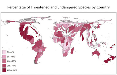
- Cartograms are maps where the geographic unit being looked at has it size and shape altered to reflect the magnitude of the variable being looked at.

- The cartogram above displays data from the Global Amphibian Assessment, a partner of AmphibiaWeb, which tracks the IUCN Red List of Threatened Species for the status of amphibians. Eight categories are assessed: Extinct, Extinct in Wild, Critically Endangered, Endangered, Vulnerable, Near Threatened, Least Concern, and Data Deficient. This map is helpful, and truly gives the extreme of the study. It is very apparent in North America and Asia, that the species is especially threatened.

- amphibiaweb.org/amphibian/cartograms/
Monday, July 21, 2008

Flow Map

- Flow maps show the movement of objects from one location to another, such migration, traffic, goods, or use in technology. The advantage of flow maps is that they reduce visual clutter by merging edges and having clean lines.

- This map shows the philosophy of King County International Airport to participate in its Fly Quiet Awareness and Incentives Programs are critical to achieve success. These flow maps help to achieve universal compliance, King County International Airport operates a comprehensive noise monitoring and flight tracking database information system and has strategically located noise monitors to measure and report decibel levels of flights.

- www.metrokc.gov/airport/pilots/fly_quiet.stm

Isoline Map

- A line connecting points of equal value, especially on a map. The "iso" means equal, so where the lines are connecting they are equal.

- The following is a isoline map depicting the annual rain run-off in Beijing, China.

- http://www.unu.edu/unupress/unupbooks/80157e/80157E0W.GIF

Proportional Circle Map


- A proportional circle map shows the relative sizes of objects or events. The larger the circle on the map, the greater the magnitude of the measured object by the scale.
- These are proportional circle maps showing the distribution of Zn (A), Pb (B), Hg (C) and Ba (D) in sediments from streams draining the Selwyn Basin, Yukon. This helps identify the mineral deposits in areas of Canada.

Choropleth Map


- A Choropleth map portray quantitative data as a color showing the density, percent, average value, or quantity of a phenomenon within the boundary of a geographic area. Each color represents a range of data values that were determined by classification techniques that grouped ranges of data values into classes.
- The map above is attempting to show the spread of the 2004 United States electoral votes, and how they might be unbalanced.

Dot Distribution Map

- A dot distrobution map is to portray quantitative data as a dot which represents a number of the phenomenon found within the boundary of a geographic area. The pattern of distributed dots reflects the general locations where the phenomenon was most likely to occur.

- This map is the 2000 popultion distrobution map for the United States. Every dot represents 7,500 people. ( if you don't like a lot of people move to the middle north west : )

- http://www.census.gov/geo/www/mapGallery/images/small2kden.jpg

Propaganda Map


- A propaganda map is used for the intent of threat, an agent of control, exploitation, manipulate and or emphasize. The propaganda overall, is a tool for power.
- This propaganda map was used by the United Kingdom to show what Germany's secret goals were to taking over Europe. This was a way to get all the people of surrounding countries that were threatened by this portrayal.

Hypsometric Map

- A Hypsometric map gives elevations by contouring, or sometimes by means of shading, tinting, or batching.

- The following is a Hypsometric map of Bitola, showing the elevation of its country.

- www.bitolaonline.com/maps.htm

PLSS Map


- PLSS maps are a good example of a systematic land partitioning (cadastral) system, which are normally used to show land ownership.

- The following PLSS is part of the Franklin County Land records and shows Townships and Ranges.

Tuesday, June 24, 2008

KML- Remote Sensing


- Remote sensing describes the science and art of identifying, observing, and measuring an object without coming in direct contact with it.

- While using google maps, I ran a search for KML satellite, and this is map shows a building specialist company that is located in Panama City, Florida.


Tuesday, June 10, 2008

Cadastral Map

-Cadastral maps show boundaries and ownership of land. They can also give additional details such as districts, street names, and current title numbers.
-This map is of an ancient area in Egypt which shows old boundary lines and districts.

Monday, June 2, 2008

Thematic maps

- A thematic map is to serve as a way to display specialized information for a variety of individuals. As well as, categories of varieties of themes that give new perspective for viewing maps to enhance the level of understanding of the particular map.
-The map shown is a depiction of the different soil depths along the Illinois River.
-http://ilrdss.sws.uiuc.edu/maps/maps_results.asp?ws=8

Topographic map


-A topographic map would show an almost accurate detail depiction of natural features on the ground. For example, when you look at this map it depicts the mountains giving a 3-D view to give you a more accurate understanding of the land.
-This map shows the Swiss Bundesamt für Landestopographie, depicting the rugged relief of the Matterhorn in 1991.

Tuesday, May 27, 2008

Planimetric map


-A planimetric map is a map that shows the overview (flat) of an area, that neglects height and vertical information.
- This type of map is showing the type of land and what its main purpose is. For example, if it is a developed area, vegetation, and if it has any water sources etc.