Monday, August 4, 2008

Windrose

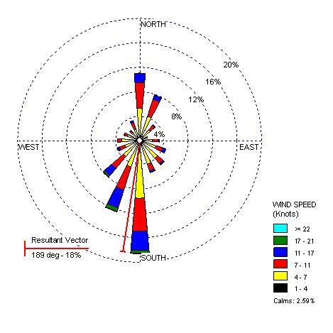
- A wind rose is a graphic tool used by meteorologists to give a succinct view of how wind speed and direction are typically distributed at a particular location. Presented in a circular format, the wind rose shows the frequency of winds blowing from particular directions.

- The following is a wind rose used to reflect 5 Washington locations: Olympia, Quillayute, Seattle, Spokane, Yakima.

- www.climate.washington.edu/climate.html

Climograph

- A climographs is a graphic representation of the relation between temperature and
precipitation as plotted at monthly intervals throughout the year.

- This Climograph is of the Boreal Region, and this is evident with the amount of precipitation in combination with the high temperatures. The precipitation is higher then other regions in Quebec due to the high temperatures allowing for the clouds to rise cool and condense.

Population Profile

- Population pyramids display age and sex distributions for a given region.

- This population profile is just an example of how a census would be reflected. On census day, the population of Coventry was recorded to be 300,848 people. The population pyramid details the age and gender profile in Coventry in comparison to the national picture.

-http://www.coventry.gov.uk/ccm/navigation/community-and-living/coventry-statistics/2001-census-statistics/

Index Value Plot

- In this plot an index value is plotted instead of an absolute number.

- The following graph provides a comparison of the cumulative total stockholder return on our common stock against the Nasdaq U.S. Stock Market Index and the average of a peer group index comprised of five publicly traded consumer electronic and/or appliance retailers (1) since our initial public offering on November 24, 2003.

Lorenz Curve

- How a Lorenz curve works: The dashed line shows how the data would be graphed if income were equally distributed. The solid dark line (the Lorenz curve) represents the actual distribution.

- This Lorenz curve follows the diagonal 'line of income equality', where 50 per cent of the population receives 50 per cent of the income, 60 per cent of the population receives 60 per cent of the income, and so on. Chart A1.2 shows that the poorer 50 per cent of the Scottish population in 2005/06 received only 28 per cent of the total income, with the richer 50 per cent receiving 72 per cent of total income.

Bilateral Graph


- This type of graph usually has two related variables that have overlapped area. The overlapped area shows where the two variables meet.

- This map shows the deposits of the money sector. The two variables are the long term deposits versus demand deposits that will be withdrawn in a shorter period of time.

- http://images.google.com/imgres?imgurl=http://www.resbank.co.za/Economics/year96/graph/graph28.jpg&imgrefurl=http://www.resbank.co.za/Economics/year96/yearrep.html&h=256&w=261&sz=48&hl=en&start=195&tbnid=dNoJubJ4kJJeiM:&tbnh=110&tbnw=112&prev=/images%3Fq%3DBilateral%2Bgraph%26start%3D180%26gbv%3D2%26ndsp%3D18%26hl%3Den%26sa%3DN

Thursday, July 31, 2008

Nominal Area Choropleth Map

- Nominal Choropleth maps portray areal data that area broken down by a group or category.

- This map is being used to represent the location and size of two gangs in Compton California.

- www.streetgangs.com