Monday, August 4, 2008

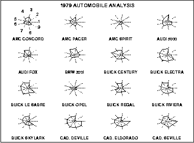
Star Plots

- Star plots allow you to compare multiple variables for each observation.

- This star plot was used to represent the differences in automobiles in 1979. I thought this was kinda of cool to see how different individuals came up with the different ways to star plot a vehicle.

- http://www.itl.nist.gov/div898/handbook/eda/section3/gif/starplot.gif
Similarity Matrix


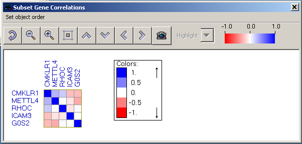
- A similarity matrix is a matrix of scores which express the similarity between two data points.

-This display shows correlations/co-occurrences between two groups of objects, or between objects belonging to the same group. One group of objects is presented as the rows of the similarity matrix and the other as the columns. The matrix cells are color-coded based on the similarity values. Blue indicates positive values and red negative ones. The scale of the colors is -1..1 by default, but if the similarity values exceed this region, the thresholds are scaled such that full blue and red colors represent the 90% percentile of the value range.

Stem and Leaf Plot


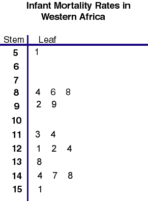
- A stem and leaf plot is a device for presenting quantitative data in a graphical format, similar to a histogram, to assist in visualizing the shape of a distribution.

-Study the data for Infant Mortality Rates, the number of infant deaths per 1,000 live births, of countries in Western Africa. Use the World Population Data Sheet in your Reference Section. You will notice that most of these values are in the interval 100 to 175. A stem-and-leaf plot for this data is shown below.

Box Plot

- A boxplot, or box and whisker diagram, provides a simple graphical summary of a set of data.
- The lines on the box plot image above represent the locations of the lowest number, first quartile, second quartile, third quartile and highest number, in relationship to a scale, running from 0 - 140.

Histogram

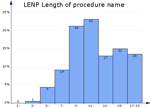
- A histogram displays tabulated frequency.

- Histogram of column. This chart displays a bar chart of the relative frequencies of different value ranges. It's useful for getting a quick look at the distribution of values of the selected metric column. The more values fall in a range, the higher the bar. In the above chart you can see that a typical procedures name consists of 7-16 characters. Shorter and longer names are fewer. There are no names with just 1 or 2 characters.

- http://www.aivosto.com/project/help/pm-histogram.gif

Parallel Coordinate Graph


- In the parallel coordinate plot, each variable is graphed on a vertical axis. A data
element is plotted as a connected set of points, one on each axis.

- This parallel coordinate (PC) graph (4) serves as the control panel for selecting attributes to be explored and provide easier identification of multivariate relationships across spatial domains in the choropleth maps and the scatter plot.

Triangular Plot


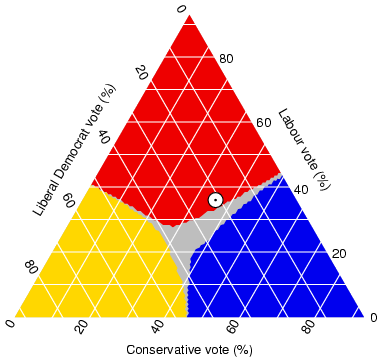
- A triangular plot usually uses three variables which sum to a constant. It graphically depicts the ratios of the three variables as positions in an equilateral triangle.

- The axes of the figure show the estimated fraction of the population intending to vote for each of the major parties; the white circle shows the current estimate from opinion polls. The coloured asses show the regions of the plot in which -- under the assumption of uniform national swing -- each of the corresponding major parties would win a majority in Parliament.

Windrose

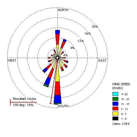
- A wind rose is a graphic tool used by meteorologists to give a succinct view of how wind speed and direction are typically distributed at a particular location. Presented in a circular format, the wind rose shows the frequency of winds blowing from particular directions.

- The following is a wind rose used to reflect 5 Washington locations: Olympia, Quillayute, Seattle, Spokane, Yakima.

- www.climate.washington.edu/climate.html

Climograph

- A climographs is a graphic representation of the relation between temperature and
precipitation as plotted at monthly intervals throughout the year.

- This Climograph is of the Boreal Region, and this is evident with the amount of precipitation in combination with the high temperatures. The precipitation is higher then other regions in Quebec due to the high temperatures allowing for the clouds to rise cool and condense.

Population Profile

- Population pyramids display age and sex distributions for a given region.

- This population profile is just an example of how a census would be reflected. On census day, the population of Coventry was recorded to be 300,848 people. The population pyramid details the age and gender profile in Coventry in comparison to the national picture.

-http://www.coventry.gov.uk/ccm/navigation/community-and-living/coventry-statistics/2001-census-statistics/

Index Value Plot

- In this plot an index value is plotted instead of an absolute number.

- The following graph provides a comparison of the cumulative total stockholder return on our common stock against the Nasdaq U.S. Stock Market Index and the average of a peer group index comprised of five publicly traded consumer electronic and/or appliance retailers (1) since our initial public offering on November 24, 2003.

Lorenz Curve

- How a Lorenz curve works: The dashed line shows how the data would be graphed if income were equally distributed. The solid dark line (the Lorenz curve) represents the actual distribution.

- This Lorenz curve follows the diagonal 'line of income equality', where 50 per cent of the population receives 50 per cent of the income, 60 per cent of the population receives 60 per cent of the income, and so on. Chart A1.2 shows that the poorer 50 per cent of the Scottish population in 2005/06 received only 28 per cent of the total income, with the richer 50 per cent receiving 72 per cent of total income.

Bilateral Graph


- This type of graph usually has two related variables that have overlapped area. The overlapped area shows where the two variables meet.

- This map shows the deposits of the money sector. The two variables are the long term deposits versus demand deposits that will be withdrawn in a shorter period of time.

- http://images.google.com/imgres?imgurl=http://www.resbank.co.za/Economics/year96/graph/graph28.jpg&imgrefurl=http://www.resbank.co.za/Economics/year96/yearrep.html&h=256&w=261&sz=48&hl=en&start=195&tbnid=dNoJubJ4kJJeiM:&tbnh=110&tbnw=112&prev=/images%3Fq%3DBilateral%2Bgraph%26start%3D180%26gbv%3D2%26ndsp%3D18%26hl%3Den%26sa%3DN